Objectives
- Students will be able to name different identity groups.
- Students will understand what demographic information is and why it is important.
- Students will examine the exit polls from the 2012 election and draw some conclusions from that data.
- Students will be able to create a survey with demographic information and analyze it.
Class Discussion
Identity Groups
Brainstorm a list of different identity groups by asking: What are some groups that you and other people belong to? If these don't come up, give examples like gender, race, age, economic class, and sexual orientation. The list might look like the following:
- Male
- Female
- African-American/Black
- Asian/Pacific Islander
- Latino/Hispanic
- Native American
- White/Caucasian
- Multiracial/Biracial
- Child
- Young Adult/Teenager
- Middle Aged
- Senior Citizen
- Poor
- Working Class
- Middle Class
- Rich
- Straight
- Gay/Lesbian
- Bisexual
If you need to define and explain any of these terms, do so by eliciting ideas from the class and clarifying if necessary. Say that there are other identity categories such as religion, ethnicity/nationality, educational background, geography (urban, rural, suburban, small town), family structure, etc.
Demographics and the Election
Explain to the students that we have some very interesting information about how different identity groups voted in the 2012 presidential election. As we'll see later, President Obama was reelected in part by winning the support of a very high percentage of African-American voters (who often vote for Democrats), as well as a large proportion of Latino voters, Asian-American voters, and voters under age 40.
The percentage of American voters who are white has been decreasing steadily over the past few decades (the white vote was 90% of total electorate in 1980, 78% in 2000 and 72% in 2012). These "demographic" changes have come quickly and there is reason to believe they will have a strong and lasting impact on our voting patterns.
Ask: Has anyone heard the term "demographic?" What does it mean? Where have you heard the word? Help students understand that the word demographic is a section of the population - such as people of a particular gender, race or ethnicity, age group, income level - or a combination of qualities like these (such as women under 40). Ask students: What demographics would be interesting to look at in terms of the election?
Exit Polls
Ask: What is an exit poll? If no one knows, ask if they can guess based on the words exit and poll. Explain that an election exit poll is a poll of voters taken immediately after they have exited their voting station. Many news organizations do polling in the U.S. (for example, CNN and the New York Times). Other organizations focus mainly on polling (such as Gallup or Rasmussen).
Exit polls are conducted while the election is going on. In an exit poll, the pollsters ask people who they voted for and questions about who they are. In this way, they can understand how different groups of voters (demographics) voted. For example, exit pollsters can ask you who you voted for and also ask your age. Later, they can look at the information and say that more senior citizens voted for Mitt Romney and more people in their 20s voted for Barack Obama based on exit polls.
Ask: Why would this information be interesting and useful? How might it be useful in future elections?
Tell the students we are going to look at some of the exit polls from the 2012 presidential election and see what we can learn from them.
Analyzing 2012 Election Exit Polls
1. Print out a copy of the chart below and if possible, project it onto a smart board or projector for viewing of the whole class.
First give a brief overview explaining how the chart works. Explain that on the left side, the gray shading and number next to it shows you what percentage of the total electorate that group represents. For example, 47% of the electorate is male and 53% female. Ask: Were there more women or men voting? How much more?
Then explain that on the right side of the chart, the blue represents the percentage of people in that category voting for the Democratic presidential candidate (President Barack Obama) and the red represents the percentage of people voting for the Republican candidate (former Governor Mitt Romney).
Have the students read aloud the bottom of the chart, noting that the survey is based on 26,565 total voters and from 350 precincts nationally (a precinct is a geographic area used in voting). The company that conducted the poll is Edison Research.
Ask: Why does the polling company survey such a large group of people? Why so many precincts? Explain that they don't have the time or money to poll every single person in the U.S. so they have to get a random sampling that is big and broad enough to give an accurate representation of the American population as a whole.
2. Have students spend 10 minutes looking at the chart and discussing it with a partner. Ask them to share what they found surprising, interesting, and confusing.
3. In the large group, have students come up with questions about the chart that other students answer. These questions will help determine if students understand the basics of the chart. You can model a question by asking: What percentage of women voted for Romney? Give several students the opportunity to ask questions and others to answer them.
4. Next, ask students to respond to deeper and analytical questions such as:
- What do you notice about the chart?
- What are the differences you notice between Obama's and Romney's supporters?
- How would you explain the reasons for these differences?
- Who do you identify with most in the chart, and why?
- Can you draw any conclusions about how the American people voted this year?
.jpg)
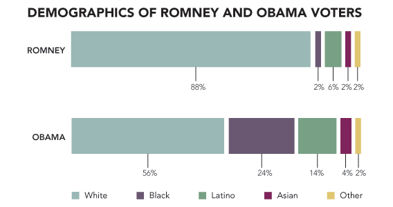
5. The chart below presents the breakdown of voters by race only. Again, hand out the chart to the students and/or project it to the entire class. Explain the chart to the students and ask:
- Does anything jump out at you?
- Is there anything that is surprising? Not surprising?
- What are the key differences between Romney and Obama voters?
- Why do you think Romney got a much lower percentage of his votes from black, Latino, and Asian voters than President Obama did?
- The two candidates had different views on many issues. How do you think this influenced each candidate's voter demographics?
(For a more complex exit poll, see: http://elections.nytimes.com/2012/results/president/exit-polls)
Create your own school poll
Tell students that as a class, they are going to create a poll or survey on a topic of interest to them. In addition to the survey, they will also ask demographic questions of the people they survey so they can analyze this information afterwards.
1. Brainstorm possible questions they could ask students in their school. For simplicity's sake, choose questions with yes/or or multiple choice answers. Possible questions could include:
- What is your favorite sport?
- Would you rather go out for lunch or eat in the school cafeteria?
- How many people are in your immediate family?
- What is your favorite television channel?
- Who did you support for president in the 2012 election?
- Which kind of book do you like best: science fiction, realistic fiction, or nonfiction?
2. Decide on 2-3 questions.
3. Discuss the identity questions you will also ask on the survey. For middle school, you might choose the following:
- Gender: Girl or Boy
- Grade: 6th or 7th 8th grade
- Race: African-American/Black, Asian/Pacific Islander, Latino/Hispanic, Native American, White/Caucasian, Multiracial/Biracial
4. Have students create a paper survey that will be completed by students in the school anonymously. It would be best to have as many students as possible take the survey. An alternative is to create an electronic survey with a program like survey monkey (www.surveymonkey.com), which will require that you have computers available so everyone can vote. The survey should contain the survey questions as well as the demographic questions so students can analyze the responses later. Include in the survey that you would like people to answer every question.
5. When all the surveys are completed and collected, have students work in small groups to add up the responses. Help them tally how different demographic groups voted for certain questions. For example, you might be able to see that sixth graders' favorite genre was science fiction and 8th graders favorite was realistic fiction.
6. Have the students create bar graphs or pie charts representing the data generated from the survey. Display these in a Word document or have students draw their results on chart paper so they can display around the school.
7. Discuss the experience with students. Ask: What did you learn by conducting a survey and collecting demographic information? What was it like to tally up the responses? What was difficult or easy? Why? Did any of the data you collected surprise you? If you had to do it again, what would you change about the survey or the way you asked the questions?
Closing
Ask students to respond to the question: Do you think studying demographics is important? Why or why not?